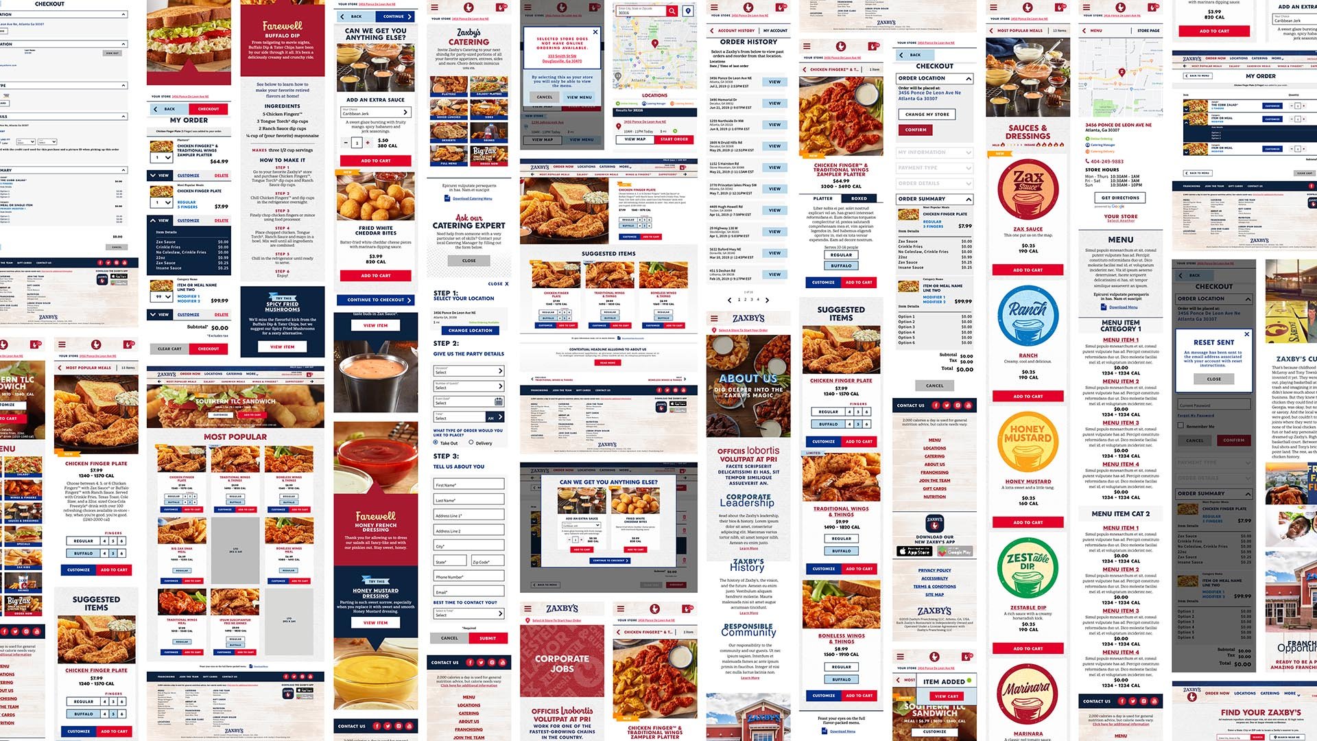
Zaxby’s Web Refresh
DIGITAL | UI-UX
With online order numbers falling well short of today’s expectations for this nation-wide quick service restaurant, Zaxby’s digital presence needed a complete refresh and was restructured to accommodate new brand guidelines, ADA compliance requirements, FDA regulations and new third party payment processors in order to improve the consumer experience and increase online sales.

From the beginning
INFORMATION ARCHITECTURE
Several iterations of the architecture followed a thorough audit of the existing website in order to develop solutions that would improve the overall user experience, increase online sales, and streamline the data management on the client side.
FLOW DIAGRAM PROCESS
Numerous flow explorations were involved in determining the needs of the client and their customers from inventory, third-party payment processes, user data collection, entry and exit points, and more.
WIRES
The wire-framing process was an extensive exploration of the multi-faceted customer interactions accounting for a plethora of menu variations, customized orders, user account settings, cart editing, and the checkout process.
User Validation Prototyping
The usability of this new shopping experience was user tested and validated at various stages throughout the design process in order to rigorously address any issues users encountered. This firsthand user feedback was crucial in insuring a smooth user journey that minimized disruptions from menu selection to checkout.
Home
Location
Cart
Menu
User Account
Checkout


