HighMatch
DIGITAL | UI-IX | DEVELOPMENT
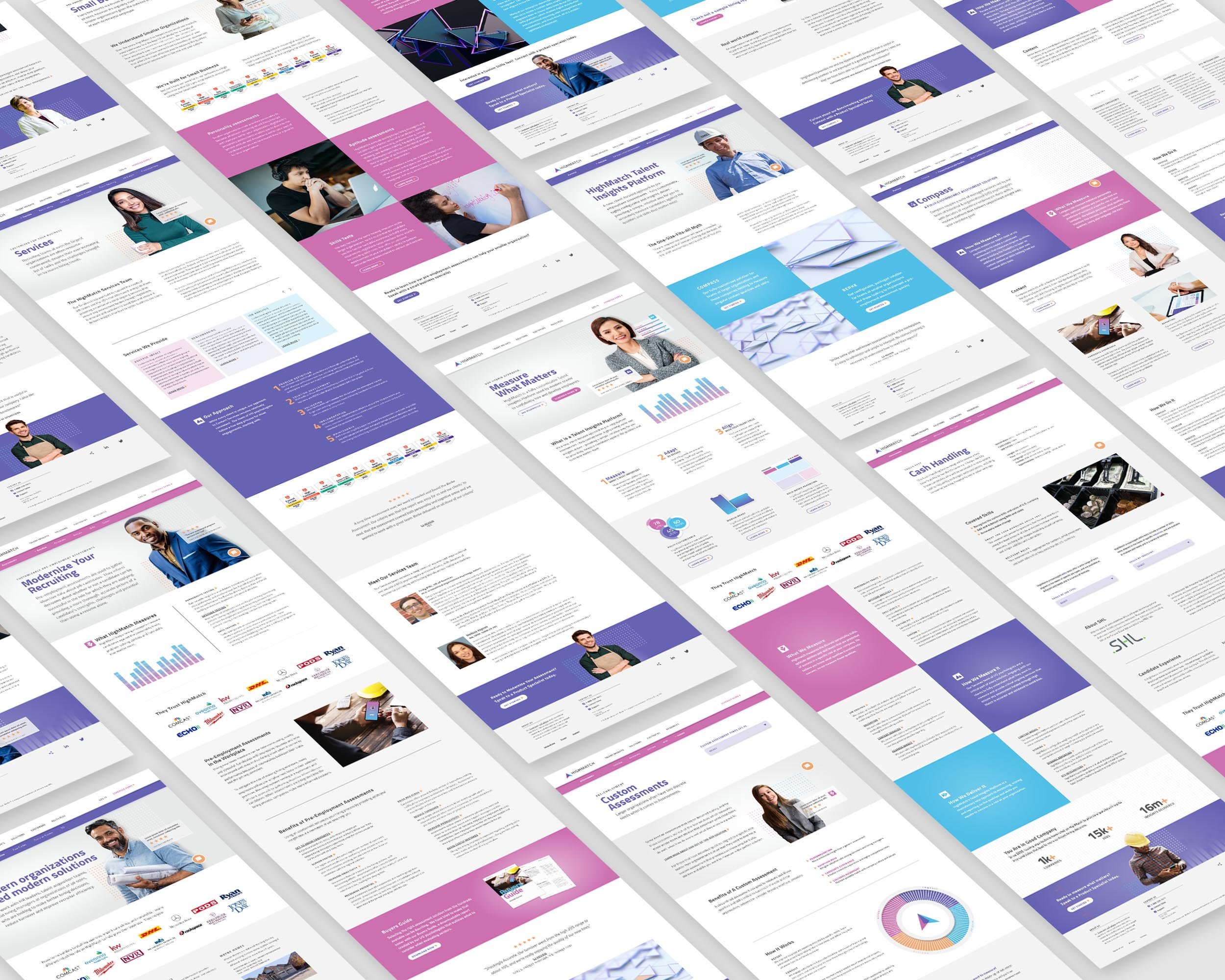
This B2B website design and build coincided with the assessment company’s new name and identity. Beginning with a complete revamping of the information architecture and ending with a Wordpress site template created for population by the client’s in-house team. Along the way, several concepts were explored which included interactive prototypes built in Adobe XD, user journey maps, and a digital design system based on the new brand identity.

Information Architecture
The architecture for this 300+ pages site was rebuilt from scratch In order to accommodate a new app-based services platform, the pre-existing services packages and multi-phased launch dates.
Setting the mood
Multiple boards were created before narrowing to these two finalists. As an assessment company, Highmatch utilizes a variety of scientifically proven measurements to help their customers find the right fit for the right job. With that in mind, the visual goal was to be personable and sophisticated.
Getting Wired
Several rounds of desktop and mobile wire-frames followed the mood selection and the completion of the Information Architecture (IA). Streamlining the UI for navigating the extensive library of content was a critical part of this project and a variety of global navigation and sub-navigation solutions were explored, tested, and prototyped.
Design to development
The final deliverables for development included 28 desktop and mobile comps (red-lined), primary-tertiary navigation systems, interactive prototypes, and asset libraries. The Wordpress CMS included a custom theme utilizing a “blocks” framework for ease of use and implementation by the in-house team.


